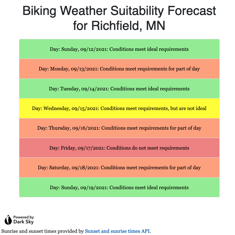
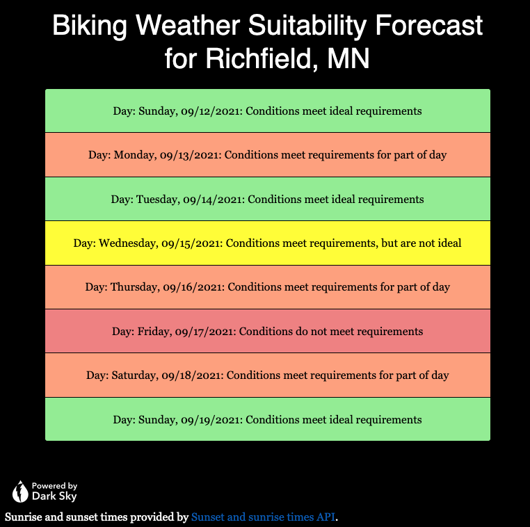
Having read a few articles online about offering a dark theme as part of improving accessibility for certain people, I decided to add a dark theme option both for my website overall, and for the Biking Weather Suitability Forecast application. I will discuss what steps I took to add this to my web application; similar changes needed to be made for overrides to the default theme CSS and script files for the general website.
The easiest thing to do was to download the dark version of the “Powered by Dark Sky” icon. This will likely need to be removed in a few months, after Dark Sky stops their “grandfathered” API support at the end of 2022.
Next, I added some overrides at the bottom of my main.css file for the case when the user-specified preferred color scheme is dark, such as when choosing “dark mode” on an iPhone or Mac.
/* Dark mode color scheme */
@media(prefers-color-scheme: dark) {
	body, .card, .table, caption {
		background-color: black;
		color: white;
	}

	td.status0, td.status1, td.status2, td.status3 {
		color: black;
	}
}
To allow writing a script that would allow changing the “Powered by Dark Sky” graphic to one with inverted colors, I added the “darksky” class to the img tag in the forecast.html page:
		<a href="https://darksky.net/poweredby">
 <img class="darksky" th:src="@{/img/poweredby.png}" alt="Powered by Dark Sky" style="height: 3rem;" />
</a>
Finally, I used jQuery and plain JavaScript to check if the dark mode was the preferred color scheme both on page load and on a change to the color scheme preference. If so, I called the “darkMode()” function shown below to change the image. Otherwise, if changed back to the default light mode, the default “bright” icon is restored. This was done by adding the following script to the bottom of forecast.html, after the default jquery, bootstrap, and bootstrap script includes.
	<script>
		function darkMode() {
			$("img.darksky").attr("src",
					"https://johnwatne.no-ip.biz/bikingweather/img/poweredby-darkbackground.png");
		}

		var mql = window.matchMedia('(prefers-color-scheme: dark)');

		if (mql.matches) {
			darkMode();
		}

		window.matchMedia('(prefers-color-scheme: dark)').addEventListener('change', event => {
			if (event.matches) {
				darkMode();
			} else {
				// Restore standard / light mode image.
				$("img.darksky").attr("src",
						"https://johnwatne.no-ip.biz/bikingweather/img/poweredby.png");
			}
		})
	</script>
The following images show examples of what the page now looks like in both the default light and optional dark mode. I will note that I need to fix the contrast on the linked text in dark mode. This will be an additional override that I will add soon to the CSS file.

